A review of Plex's redesign as an avid graphic designer
I am a sucker for good design. I love clean interfaces, good font choice, colors, anything. Although my own designs can lack sometimes, I do like graphic design as a whole. Most services I use are an extension of the belief. If I have to interact with it daily, I’d prefer it to have a clean design. This is why I fell in love with IOS and MacOS which really made me love interacting with my devices.
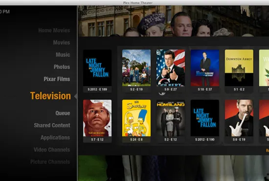
Plex is an application that I do like to use quite frequently now and have had a history with (as far back as the Xbox 360 haydays). However, I didn’t appreciate it until I started to self host more of my own stuff. Initially I brushed it off even, resorting to open source or free alternatives that “got the job done anyway” so I was never really a huge fan until recently. Surprisingly, despite the redesign efforts, Plex does not seem to really require one. Currently, with the old but definitely still usable/clean UI, it does hold up as a modern application with maybe some company related flaws. It most certainly does not look the same way it did before a long time ago. For example, here is the Plex desktop application from late 2012.
Even this I do not mind, despite being a little dated looking. Nonetheless, I still appreciate efforts to keep things clean and modernized which is why I am writing something specifically about this redesign, as it seems the most drastic reaching a calamity of the various design changes Plex has made over the years. Currently as of July 2025, the only way to directly access Plex’s redesign is to use their preview or beta applications. Even though this is a redesign, some of the changes are enough to break Plex and so yes, there were at least a few (but infrequent) protruding bugs. Bugs are excused considering that you are testing a “preview” or a “beta” application. I tested the redesign on the Roku preview. This cannot be unlocked normally, instead you need to login to your Roku account and add the code “plexpreview” under the add channel by code section. At first the changes seemed like nothing on the Roku but after selecting a profile, you are brought to the modernized user interface. I do agree this is a clean interface change. It has a row of buttons at the top for the various functions Plex serves.
Namely, a home, your libraries, live tv, on demand and discover. This is stuff which appears in the other applications so it’s simply just the normal stuff organized in a different way. So far, from first impressions I do like the changes. Upon starting the app, are greeted with fancy gradients and a large logo of the content you have selected. Beyond continue watching, the homepage divulges what is currently on live tv, content recently added to your Plex server, and a general list of trending or on demand selections. So, upon first impressions, this seems to match what is seen on the regular old app.
The IOS version surprisingly mimics this experience from the Roku pretty well. They feel connected. It also does admittedly look nice, especially when you visit the show or movie page you want to watch. The first part of the page is a heading with a nice picture of the show, either from promotions or just a general image. Then the logo, the biggest addition, is overlayed towards the bottom. The logo is followed by a row of buttons which feature some common actions like adding to your watchlist or downloading.It’s important to note how typography plays a central role in the user experience. Plex’s redesign uses a combination of clean, sans-serif fonts, the same ones as before, which feel modern without being overly sterile. Their updated use of typography creates a perfect balance between readability and style.
I could never talk about graphic design without mentioning my favorite part. The typography. Plex has continued their use of the font they use for headings which is a modified version of Circular made for Plex. It stands out with a couple of modified letters, which almost look bubbly in a way. Then they use another custom font “Plexina” which I feel is akin to a stretched “Brandon Grotesque” with more body to the individual letters. Honestly, they both look great even if they already were using these fonts and didn’t need a change. The type wasn’t changed and was simply just brought over.
The color scheme in the redesign is another standout feature. The gradients, which blend the imagery of the content with the background, create a harmonious transition between the promotional artwork and the UI elements, providing a seamless viewing experience. The use of complimentary colors (often drawn directly from the images) helps create a dynamic and visually engaging page that doesn’t feel cluttered, even though it presents a lot of information. The muted tones of the background ensure that the content remains the focal point, while the accent colors on buttons or logos provide just the right amount of contrast to catch the user’s attention without overwhelming them.
The icons are simple yet distinct, I could easily see them on the TV and on my phone. The size and placement of these buttons follow principles of proximity and alignment. Key actions like adding to a watchlist or downloading are easily accessible without feeling intrusive, while other functions are tucked away. The spacing between content sections and the careful use of negative space ensures that the interface feels open and not overcrowded. This is particularly important as it prevents users from feeling overwhelmed when browsing through large libraries, maintaining a sense of clarity and focus.
I personally love the new changes. Every design decision contributes to an overall sense of refinement. These small details elevate the overall design, making it feel sophisticated and premium.
The new redesign seemingly draws inspiration from traditional streaming services, which usually do a mix of the same elements. When you browse Plex, it feels more clean and spaced out then it’s predecessor. The other changes to the general design are also welcome as they simply modify without taking functionality. For example, on the IOS app, they user selection screen does look different but it does not change anything about selecting a user, just the way it looks.
So far, with the way I have written about these changes, this looks like just a redesign. It simply just takes what is already there and cleans it. Before Plex did not have logos for the individual show or movie pages, now it does. Before, you had to select your libraries by moving to the left side, but now it’s at the bottom after continue watching. Just seemingly nice to have changes to the look and feel but the design changes end there. With the new app, Plex made some changes to its core which may be annoying to people who primarily use it as a way to consume personal media.
First, the sections I mentioned earlier with paid or ad supported content cannot be removed. Unless they plan to sync this with the web application and simply turn off sections you don’t want across all applications, Plex does not currently allow you to turn any of their content off. Before, if the Plex provided sections were off, your entire experience would simply just be what you own. Now they are including what they have too.
Additionally, they removed a crucial feature many people used. The “watch together” feature. Plex was one of the few applications to not remove this as a feature like how Disney Plus did. A lot of people relied on it, especially for long distance families or really any reason. You could invite other users on your server and watch together. It really set them apart and was a rather simply feature in hindsight. With it removed, many protested and I agree. I too used the feature and if it goes missing, there are not many other options to choose from.
Lastly, Plex has not yet implemented any streaming information badges. I would’ve liked to see Dolby Atmos or Vision badges, DTS, or anything similar but its still the same as before (this still applies as of October of the same year). Applications like Infuse do display the info so it’s just more of a personal preference that would’ve been a great addition.